Category: Design

  • Calligraphy for Blue Eye Samurai on Netflix

    Calligraphy for Blue Eye Samurai on Netflix

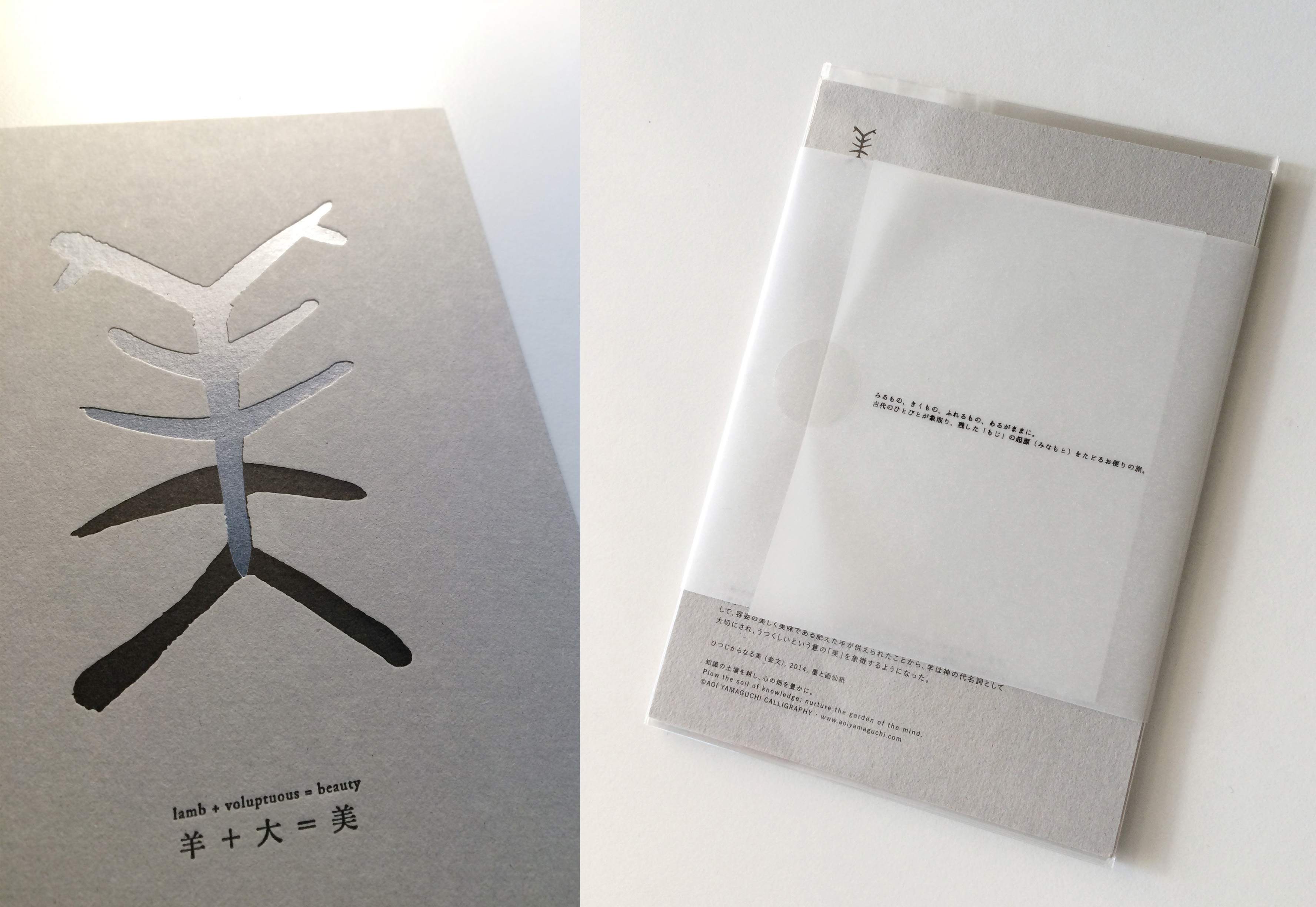
    [vc_row][vc_column][rs_special_text]Calligraphy for Blue Eye Samurai: On View on Netflix[/rs_special_text][/vc_column][vc_column][vc_video link=”https://www.youtube.com/watch?v=nJ1yQn17lbE” align=”center”][/vc_column][/vc_row][vc_row][vc_column][vc_column_text]I had an honor to work on the kanji title of @netflix Blue Eye Samurai, 『碧眼』“Blue Eye”.

    「碧」(blue) is also part of my name 碧生 — but I wanted this 「碧」to be unique, in a way that reminds viewers of the protagonist Mizu.

    I was looking at Mizu’s eyes, the sharp, elongated, handsome eyes. Then exploring the various writing styles from historical references, I resonated with the style of Zhao Mengfu in Yuan Era, with 5th stroke 白 (white) similar to the sharp Mizu’s eyes. From this idea as a starting point, I worked on versions of sketches. I had this remark from the director Jane Wu – even “silence before drawing the sword” to be translated into the movement of brushstrokes, lingering in my head.

    Finally, we landed to the final design — the first stroke of both characters are written in a triangular shape that evoke an imagery of the moment when a Katana (sword) being drawn out of its Saya (case). 碧 with that Mizu’s sharp eye. The last stroke of 眼 piercing through the 9th vertical stroke, which reminds you of the last sword movement that pierces through the opponent with no hesitation.

    Thank you Amber Noizumi, Michael Green, Jane Wu and especially Nicholas Cofrancesco for the wonderful opportunity to work with and trusting me with the process.

    Original works written with a horse hair brush with Sumi ink on high-grade gasen-shi paper.

    Read interview on TUDUM Netflix: Immerse Yourself in This ‘Blue Eye Samurai’ Research Guide to Edo-Period Japan 
    Calligraphy was central to communication and reflected the style of the writer.

    *

    11月3日Netflixにて配信開始となった「Blue Eye Samurai / ブルー・アイ・サムライ」の漢字題字揮毫、また劇中の様々なシーンに登場する、手紙、看板、刀剣制作工程などの、手書きの筆文字の多くを手がけました。

    題字の『碧眼』については、私の名前の一部である「碧」が入っていることからより思い入れも深く、いかにこの二文字を、作品の看板となる題字として「Blue Eye Samurai」を代弁できるような表現が出来るかに試行錯誤しました。

    着想を得たのは主人公「みず」のその鋭い眼。復讐の旅に出る孤独な侍の断固として揺るぎなくも、どこか繊細で鋭いシャープ感がある目の形をスケッチしながら書体を考察して行く中で、趙孟頫の「碧」の白の書き方にみずの瞳を彷彿とさせるものがあると思い、そこからデザインを展開していきました。監督ジェーンの「刀を抜く前の静けさをも」表現するような線を書いてほしい、との声を、何度も反芻しながら。

    最終的に辿り着いたのは、刀を鞘から抜き取る瞬間を思わせるような運筆で書いた「碧」と「眼」の第一画目、みずの眼をイメージした「白」のある「碧」、そして対峙者を一瞬で仕留めるような鋭く迅速な刀裁きをイメージした「眼」の最終画は九画目の縦線を貫く形。全体として、一寸の油断も許さないような力強くスピード感ある運筆で、この若き侍のスレンダーな身なりと卓越した刀の動きとを想いながら揮毫しました。

    制作に関わってから2年、ついに公開を迎え、感慨深い思いです。脚本を書かれたアンバー・ノイズミ、マイケル・グリーン(LOGAN/ローガン、Blade Runner 2049/ブレード・ランナー2049)、監督のジェーン・ウー率いる才能溢れる制作チームの一員として、書を通して制作に関われたことを光栄に思います。ハリウッドならではのスリル溢れるアクションは言うまでもなく、また違った角度から日本文化と歴史を、そして人種・アイデンディティについても考えさせられる、日本への深い愛を感じられる作品だと思います。ぜひご高覧いただけたら嬉しいです![/vc_column_text][/vc_column][/vc_row][vc_row][vc_column][rs_image_block align=”align-center” image=”8105″][/vc_column][/vc_row][vc_row padding=”pt-70 pb-70 pt-xs-50 pb-xs-50″][vc_column width=”1/3″][/vc_column][vc_column width=”1/3″][rs_buttons btn_size=”btn-medium” btn_link=”url:https%3A%2F%2Fwww.netflix.com%2Ftitle%2F81144203″ btn_text=”WATCH BLUE EYE SAMURAI ON NETFLIX” text_color=”#ffffff” background_color=”#333333″][/vc_column][vc_column width=”1/3″][/vc_column][/vc_row]

  • Interview Featured in The Design Kids

    Interview Featured in The Design Kids

    [vc_row][vc_column][vc_column_text][/vc_column_text][/vc_column][/vc_row][vc_row][vc_column][rs_special_text tag=”h3″ font_size=”35px” font_color=”#141414″]Interview Featured in The Design Kids[/rs_special_text][rs_space height=”25px”][/vc_column][/vc_row][vc_row][vc_column][vc_column_text]The Design Kids is creating and extending a network of such powerful and vibrant design community around the world. The adventurous founder of TDK, Frankie Ratford and I met at -ing Creatives Festival in Dubai back in April, and we shared an amazing times together at the conference. It’s amazing how the world is getting smaller and smaller, and how we can stay in touch over the internet world, wherever we are on this planet.

    For their featured artists’ interview, they asked me some fun questions. While talking about my “earliest creative memories”, it took me to all the memories of my childhood in Hokkaido, and it was hard to make it into a nice and sweet, short answer… but yes, what I’m doing now and 5-6 years old self are almost the same, maybe a little grown-up version. Living now in Berkeley, California, I miss Hokkaido so much. I’m so blessed and so fortunate to have these opportunities to share my little fantasies with everyone, including you, who’s reading this. Thank you for stopping by, I really appreciate your time. Ok, it’s time to go back to the nature for me now, I’m going to camping tomorrow into the wilderness of California.

    The interview is now online. Have a read if you have a moment![/vc_column_text][/vc_column][/vc_row][vc_row][vc_column width=”1/3″][/vc_column][vc_column width=”1/3″][vc_btn title=”READ THE INTERVIEW” style=”classic” shape=”square” color=”black” align=”center” css=”.vc_custom_1533084118037{background-color: #ffffff !important;border-radius: 1px !important;}”][rs_space height=”50px”][/vc_column][vc_column width=”1/3″][/vc_column][/vc_row]

  • Talk & Workshops at -ING Creative Festival, Dubai 2018

    Talk & Workshops at -ING Creative Festival, Dubai 2018

    [vc_row][vc_column][vc_raw_html]JTNDaWZyYW1lJTIwc3JjJTNEJTIyaHR0cHMlM0ElMkYlMkZwbGF5ZXIudmltZW8uY29tJTJGdmlkZW8lMkYyOTQwOTUxMzYlMjIlMjB3aWR0aCUzRCUyMjkwMCUyMiUyMGhlaWdodCUzRCUyMjUwNyUyMiUyMGZyYW1lYm9yZGVyJTNEJTIyMCUyMiUyMGFsbG93JTNEJTIyYXV0b3BsYXklM0IlMjBmdWxsc2NyZWVuJTIyJTIwYWxsb3dmdWxsc2NyZWVuJTNFJTNDJTJGaWZyYW1lJTNFJTBBJTNDcCUzRSUzQ2ElMjBocmVmJTNEJTIyaHR0cHMlM0ElMkYlMkZ2aW1lby5jb20lMkYyOTQwOTUxMzYlMjIlM0UtaW5nJTIwQ3JlYXRpdmUlMjBGZXN0aXZhbCUyMCU3QyUyMDIwMTglM0MlMkZhJTNFJTNDJTJGcCUzRQ==[/vc_raw_html][/vc_column][/vc_row][vc_row][vc_column][vc_column_text]

    I’m excited to announce my upcoming talk and workshops at -ing Creative Featival in Dubai, UAE this April from the 11th – 13th, 2018.

    I will be teaching two workshop sessions, April 11th and 13th at 10:40am – 12:40pm.
    I will be giving a talk on April 11th at 13:50 – 14:10. For more details and registration, please visit here.

    In celebration of Internatinal Women’s Day, -ingcratives is having a special promotion on female-led workshops, with discount on tickets for 7 days from March 8th until the 14th. Get your tickets while the offer lasts at ingcreatives.com

    Looking forward to seeing you all in Dubai!


    [/vc_column_text][/vc_column][/vc_row]

  • TALKS, WORKSHOPS, PERFORMANCE at TYPO BERLIN 2017

    TALKS, WORKSHOPS, PERFORMANCE at TYPO BERLIN 2017

    I’m excited to announce that I was invited as one of the guest speakers at TYPO Berlin 2017. TYPO Berlin is one of the most important creative conferences in the world, with around 1,500 participants, more than 60 speakers from all around the world giving lectures, workshops and panels on up to 5 stages, for 3 days at the most beautiful venue in Berlin, HKW – Haus of World Cultures. With the theme “wanderlust”, TYPO Berlin 2017 takes place from May 25th – 27th. I will be giving a talk, presenting a live performance and teaching two workshops during the conference.


    Talk
    Thursday, 25 May 2017, 18:00 | place: Hall

    Sho Ha Hito Nari: Brushes, strokes and a reflection of self
    In Japanese culture, the art of calligraphy is not only the expertly painted characters; it is the spiritual journey of the calligrapher to infuse herself in the work and see herself reflected back.  Using her works to illustrate this concept, Aoi Yamaguchi will explore this duality between the visual representation of her art and the constant search for self through the brush strokes.

    Performance
    Thursday, 25 May 2017, 21:00 | place: Hall

    LINLOW: Towards Transcendence
    Interactive Calligraphy & Sound Performance 

    with Schneider TM & Mika Satomi

    Aoi Yamaguchi performs a conceptual and interactive large-scale live calligraphy in collaboration with Berlin-based musician Schneider TM and e-textile artist Mika Satomi, inspired by the TYPO Berlin 2017’s theme “Wanderlust”.

    Calligraphy is a unique art form; it deconstructs and transforms existing linguistic conventions through the calligrapher’s brush. The calligrapher infuses the character with her interpretation of the idea which makes each performance unique. The performance invites you to experience the art of Japanese calligraphy and to explore the connection between the body and the mind as Yamaguchi creates the physical representation of an idea with her brush, stroke by stroke.

    During the performance, the calligrapher’s movement is captured by sensors and translated into a signal that controls part of the instruments. Each motion of her brush is enhanced by sensors that augment Schneider TM’s composition adding a unique and powerful modulation and pulsation that entices the audience become part of the piece.

    ** 琳瑯 (Linlow) is an old Japanese word, meaning:

    1. Beautiful gem stones, beautiful poems, poetry
    2. The beautiful sound made by beautiful gemstones touching each other.

    琳瑯 is cited from one of my favorite authors Soseki Natsume, as he’s written in his book Kusamakura, in quote:「芸術家は無数の琳琅を見、無上の宝璐 (ほうろ) を知る」”Artists sees the countless beautiful poems (literatures / compositions) and knows the greatest treasure”.


    [symple_button url=”https://www.typotalks.com/berlin/2017/schedule/talk/?tid=39816&et=TYPO%20Berlin%202017″ color=”grey” size=”default” border_radius=”3px” target=”self” rel=”” icon_left=”” icon_right=””]MORE ABOUT PERFORMANCE[/symple_button]


    Workshops
    Friday, 26 May 2017, 15:00 – 17:00 | place: Foyer
    Saturday, 27 May 2017, 15:00 – 17:00 | place: Foyer

    [symple_button url=”http://www.typotalks.com/berlin/” color=”grey” size=”default” border_radius=”3px” target=”blank” rel=”” icon_left=”” icon_right=””]TYPO BERLIN 2017 OFFICIAL SITE[/symple_button]
    [symple_button url=”http://www.typotalks.com/berlin/2017/schedule/” color=”grey” size=”medium” border_radius=”3px” target=”blank” rel=”” icon_left=”” icon_right=””]VIEW SCHEDULE[/symple_button][symple_button url=”http://www.wpexplorer.com/symple-shortcodes/” color=”grey” size=”default” border_radius=”3px” target=”blank” rel=”” icon_left=”” icon_right=””]VIEW SPEAKERS[/symple_button]

    Looking forward to seeing you all in Berlin!

  • New Letterpress Postcard Series "ORIGINS: もじのみなもと" No.1「ひつじからなる美」Beauty / Voluptuous Lamb

    IMG_3024_web

    IMG_3020_web

    IMG_3011_web

    IMG_2954_twin_web
    温故知新 ー「古きを訪ねて新しきを知る、これぞ師とするに相応しい」とは孔子の云ったことばです。古きを学ぶというのは、そこから万古不変の真理を知り、自らの糧にするということ。いま現代にいきる私たちが、教えられた通りに覚え、当たり前のように使っている文字たちは、いったいどうしてこういうかたちをしているんだろう。どんな人々がどんな景色を見て、幾人もの手を経て、描かれてきた記号なのだろう。そんなわたしの知的好奇心から、こうして文字の起源を辿っていったら、みるもの、きくもの、ふれるもの、あるがままに、古代の人々が象取って、残した「もじ」のかたちが見えてきました。

    そこで第一弾は、2015年の干支「羊」をテーマに、年賀状として送れるポストカードを作りました。

    ORIGINS もじのみなもと
    No.1:「ひつじからなる美」/ “Beauty / Voluptuous Lamb”

    「美」とは大きく成熟した羊の、上から見た角から足までの全体の容姿を象った文字。「羊」とは正面から見た羊のかたちを象った文字。古代では神への犠牲(いけにえ)として、容姿の美しく美味である肥えた羊が供えられたことから、羊は神の代名詞として大切にされ、うつくしいという意の「美」を象徴するようになりました。この「美」に隠れた「羊」の存在が、パール箔押し加工できらきら浮かんで見えます。あなたの2015年が、美しく輝くものになりますよう、という願いをこめて。いまわたしの手元から、あなたの手に渡る「もじ」のせかいを、お便りの形でお友達や大切なひとに渡してみませんか。

    Inspired by the history of the origins of Kanji characters, I have crafted a series of unique postcards titled “ORIGINS.” As the coming year of 2015 is the year of lamb, I have chosen the first character of the series to be “美 (beauty)”, which was originated from the symbol of “羊 (lamb)”.

    The early Chinese and Japanese characters forms were modeled after the natural world. The hieroglyphic character for beauty (美) is a rendering of a mature sheep from its head to its legs. The character for sheep (羊) is the form of the sheep as seen from the front.

    In ancient times, sheep were sacrificed to the gods as they represented fertility and the promise of new life. Over time the sheep became more closely associated with the divine; so much so that the symbol of the sheep came to represent beauty in the character “美”.

    In wishes for your year to be a beautiful one…

    You can purchase the cards from online store!
    We ship worldwide.

    → ONLINE STORE / オンラインストア

  • Absolut Vodka x Aoi Yamaguchi "戀矢文 KOIYABUMI" Behind the Scenes

    去年4月に頂いたAbsolut Vodkaとのコラボプロジェクト。詳細をすっかりポストし損ねていましたが、ここでアップしたいと思います。

    このAbsolut Outrageous Masterpieceというプロジェクトは、AbsoluteVodkaが選ぶアメリカ各主要都市のアーティスト数名がボトルをペイントし、それぞれそのボトルをフィーチャーするイベントをバー/クラブで開催するというもの。テーマは、同性愛コミュニティー人権擁護ということもあり、イベントはそれぞれの都市にあるLGBTバーやクラブという、またひと味変わったキャンペーンでした。私の身長よりも少し小さいくらいの、等身大サイズのAbsolutボトルを渡され、それを半月程かけてペイントしました。 コンセプトを練ること数日。 日本人である私らしいコンセプトは何だろう?と考えた末、頭にラブレターと矢文が浮かんできました。

    Koiyabumi_1

    Koiyabumi_2 
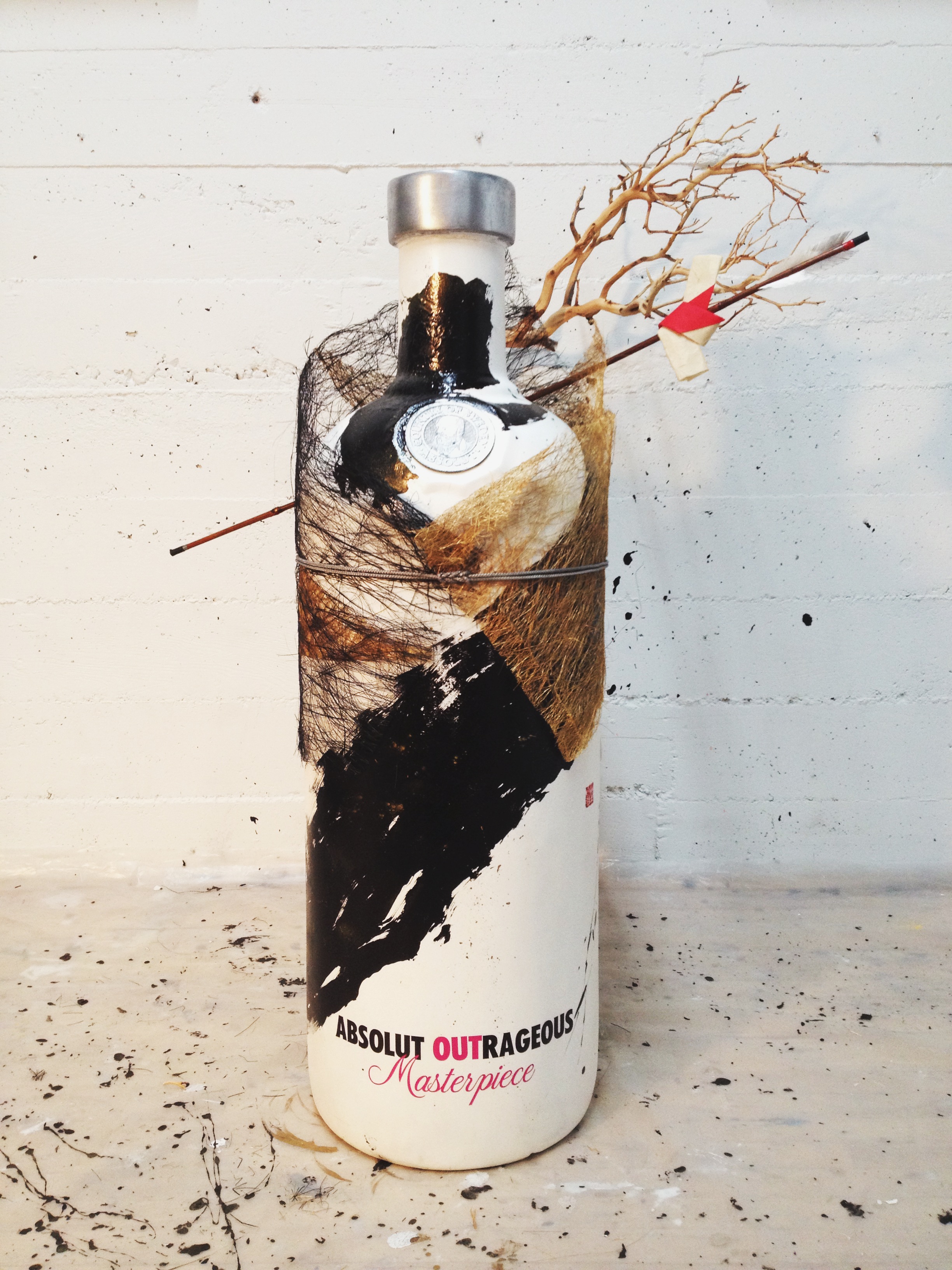
数日かけてGessoで下地づくり。大事なところはマスキング。

    Koiyabumi_3 
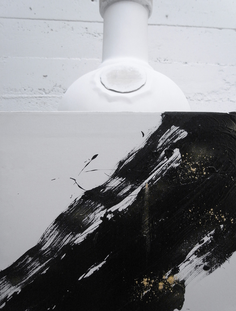
インクとペンとを混ぜたものの乗り具合、ゴールドの乾き具合を見る。 最後のヴァーニッシュで光沢が出て、黒に深みが。

    Koiyabumi_4
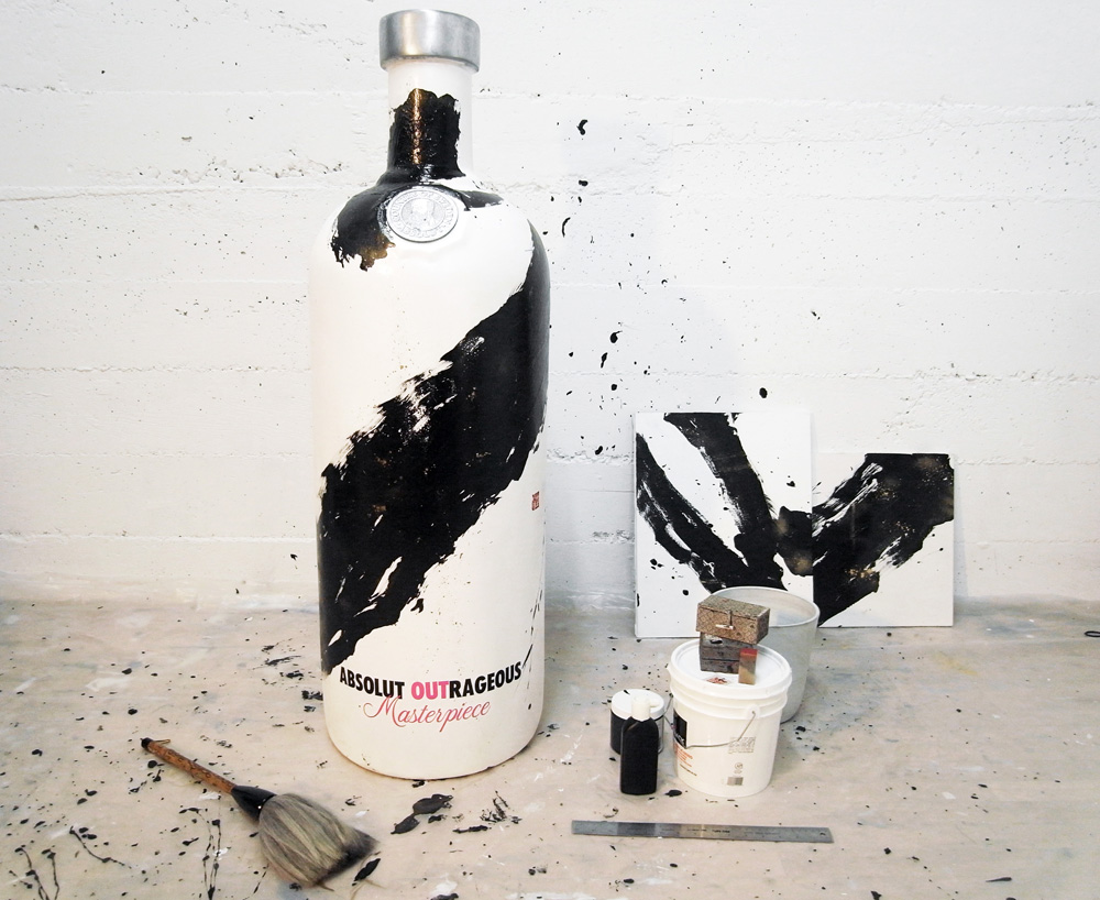
ペイント後。スタジオの壁にもかなり派手にやらかしました。

    Koiyabumi_5

    ロゴステッカーを貼ると、締まりましたね。
    次は、着物をイメージして考えたデコレートに使う紐を墨で染める作業。
    やっぱりどこまでも書にこだわりたいなと。

    dye_rope

    feather 
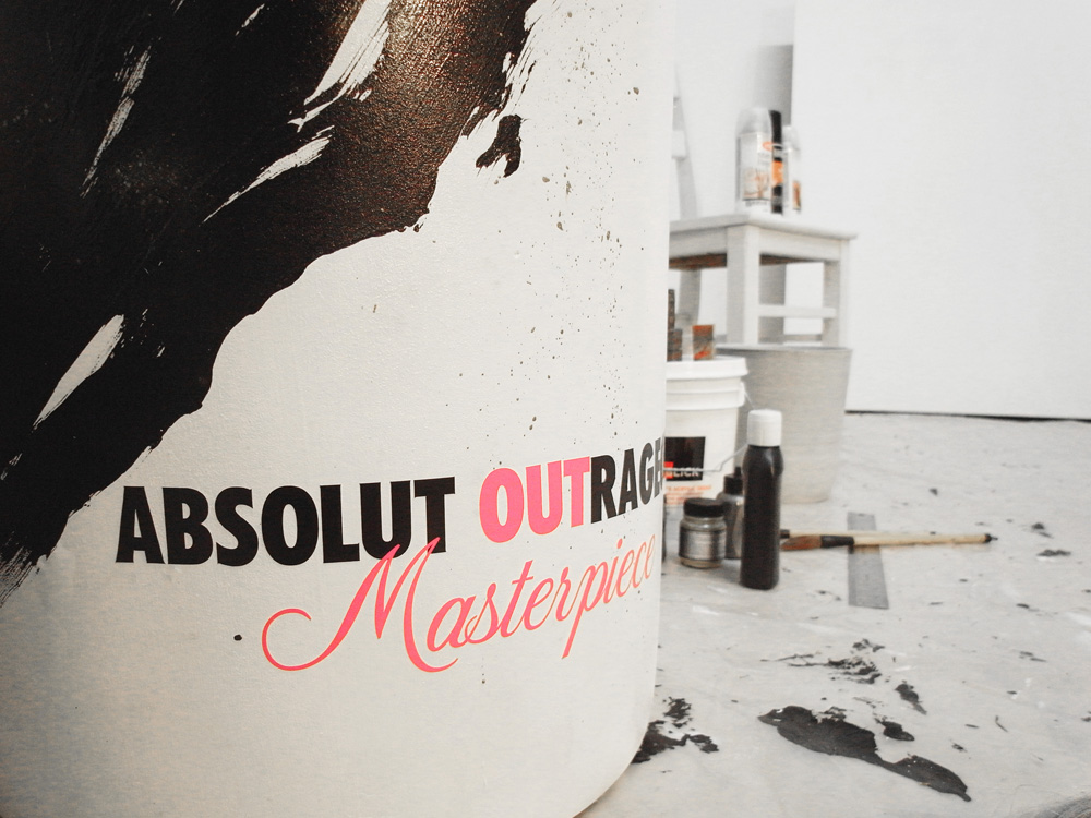
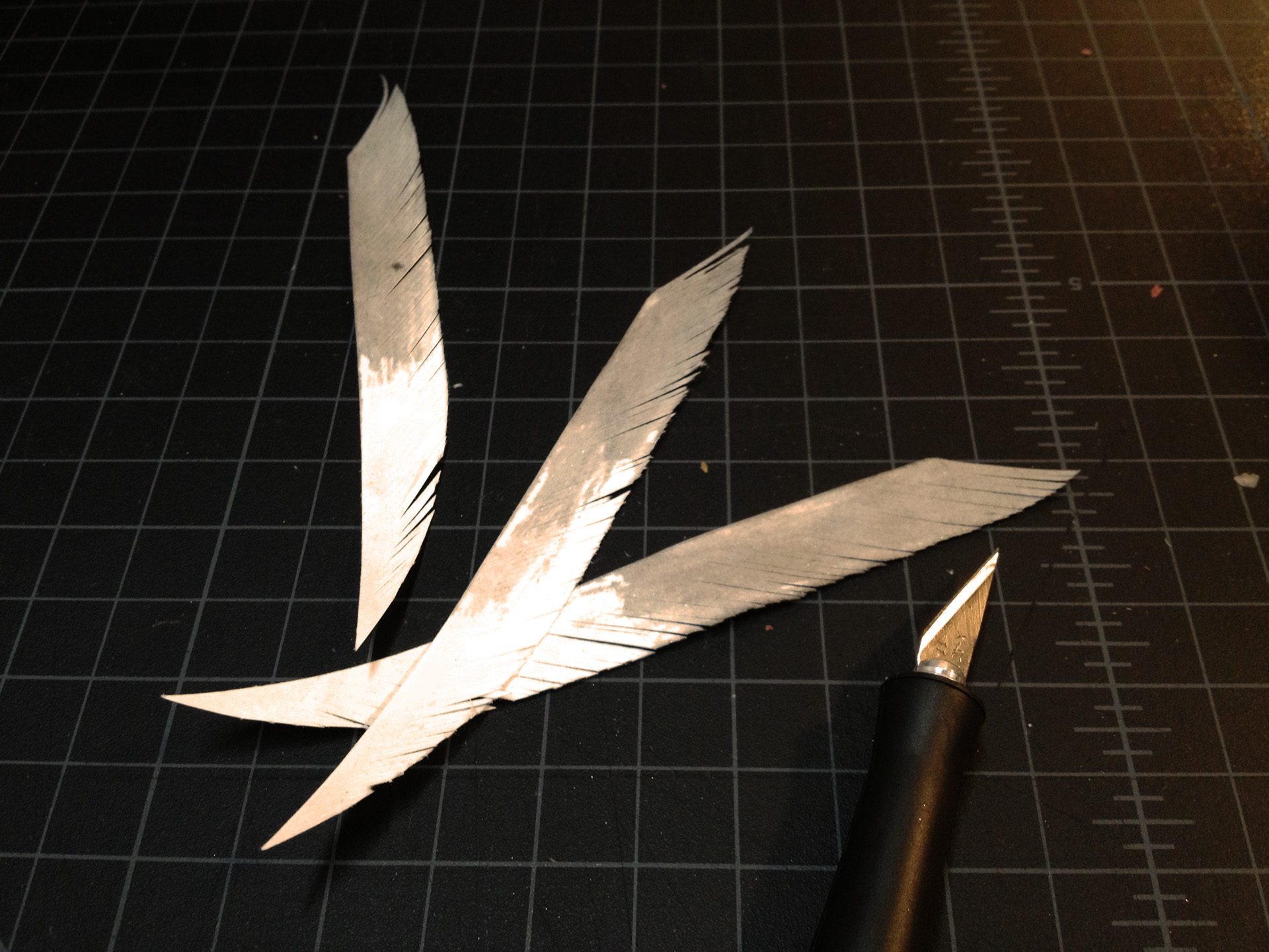
矢に使う羽も、和紙を墨でさっと色付けしてから切り込みを入れた。

    Koiyabumi_final

    My approach for Absolut Masterpiece Bottle:

    “戀矢文 / KOIYABUMI”

    During warfare in pre-modern Japan, “Yabumi” were messages affixed to arrows and launched to communicate covertly over a distance. Through this indirect method of correspondence, the sender’s identity could be hidden. Introducing Yabumi into modern society, these arrows could now serve as a metaphor for those who are forced by social pressure to conceal their true feelings. The action of shooting a love letter affixed to the arrow has a dual symbolism; not only does it challenge any opponents of the romance in society, it also unleashes direct communication of love between two romantic partners. “Koi-Yabumi”, my original word combination of Koi (in love) with Yabumi, seeks to recast this military artifact into a positive symbol representing the struggle of the LGBT community against legal, cultural, and institutional discrimination in our culture — It is the artistic embodiment of each person’s inherent need to freely express their feelings of love and affection regardless of gender, creatively challenging society break down all artificial obstacles to the arrow of love.

    戦国時代、「矢文」は手紙を結びつけて放つ事で、相手と距離を保ちながらメッセージを伝達する手段として使われた。この遠隔的な伝達方法により、送り主のアイデンティティを隠す事が出来た。これを今の現代社会に置き換えて考えると、「矢文」は自分の本心を隠さざるを得ない社会の抑圧の比喩とも例えられる。恋文、すなわちラブレターを結びつけた矢を放つという行為は、同性愛者に対する社会の抑圧に挑戦するという意味だけでなく、恋人同士が素直に想いを伝えあうということも意味する。これを「戀矢文」として、戦国時代からの産物である矢文を、私達の文化に置けるゲイ•レズビアン同性愛者に対する法的、文化的、社会的差別とその苦悩に挑戦するということを象徴するポジティブな意味合いを持つシンボルとして、現代に置き換えて表現したいと思う。個々が性別を超えて自由に愛を謳える権利を持っているということ、そして全ての人工的な障害物を愛の矢で破壊していくということをアートで表現しようとする試みである。

    Calligraphy on the bottle: Dissected Kanji character of “文” (Fumi: a letter / a note).
    Media: Acrylic paint, Sumi Ink, Matte Medium, Pigment, Clear Glaze, Paper, Rope, Bamboo, Branches

  • [Upcoming] An Exclusive Night of Sebastian Plano Solo Concert + Live Visuals

    Sebastian Plano, an amazing multi-instrumentalist & composer, whom I have been working on a collaborative performance project with, launched a Kickstarter campaign to support his two upcoming albums. In support of this Kickstarter campaign, Sebastian will be presenting you an hour live performance, including new songs from his two upcoming albums. I will be performing live visuals projected on the wall of this beautiful venue, inspired by his music.

    5月のArtPad Fairでのパフォーマンス”UNiBIRTH”を見に来てくださった方々はご存知と思いますが、ここ数ヶ月間、共にコラボレーションプロジェクトを進めている私のクリエイティブパートナー、セバスチャン•プラノが、今年11月と来年3月に二つのアルバムリリースを控えています。一つはかの有名なKronos Quartetのチェロ奏者、Jeffrey Zeigler(ジェフェリー•ゼイグラー)氏とのコラボレーションアルバム「Novel」、もう一つはセバスチャン自身の二枚目ソロアルバム「Impetus」。このソロアルバムは、私も個人的にファンの、ベルリンのネオクラシカル音楽プロデューサーNils Frahm(ニルズ•フラーム)がサウンドエンジニアを手がける事が決定しています(Olafur Arnaldsともコラボしている、最高に美しい音楽を創るピアニストです)。その制作費を賄うため、Kickstarterキャンペーンを一ヶ月間実施しており、来週月曜日に〆切を控え、私とセバスチャンでミニライブショーを開催する運びとなりました。

    8月18日(土)、Ensomaにて45分間の生ソロ演奏、そして私は彼の音楽にインスパイアされたライブビジュアル(VJ)を披露します。チェロ、ピアノ、パーカッション、エレクトロニックサウンドを融合した彼の優美で叙情的な音の世界に魅了される、濃密な一時間となると思います。ぜひご都合の着く方は、お誘い合わせの上足を運んで頂けると幸いです。

    Saturday, August 18, 2012 | FREE Entrance
    Venue: Ensoma | 352 6th St, San Francisco
    Door 7:30PM, Starts 8PM

    Make a pledge & donation at the concert if the music inspires you.
    For the pledge of $50 or more, you will receive my “UNiBIRTH” series limited edition postcard set for rewards!
    Wine and refreshments will be served.

    * Your support will help Sebastian Plano release two upcoming albums:

    Novel
    Collaboration with cellist Jeffrey Zeigler from world renown Kronos Quartet.
    Release date: Nov. 2012

    Impetus (solo)
    Sound Engineering by Nils Frahm in Berlin.
    Release date: Mar. 2013

    VIEW KICKSTARTER CAMPAIGN

    _
    About Sebastian Plano:

    Born in a musical family in Argentina, Sebastian Plano is a classically-trained contemporary music composer / multi-instrumentalist. Exploring his strong roots in folk music, Tango, and enchanted by the resonance of electronic music, he began to interpret his imagination into own sounds at the age of 12.

    Besides his main instrument, cello, Plano skillfully meshes the sounds of the piano, bandoneon, percussion, and his vocal, and creates entirely new soundscapes. Its passionate yet graceful melody paints a cinematic landscape of the world unseen – allures you to be lost in the pleasant waves of divine sounds, and leaves you sway within a dream filled with reminiscent moments.

    Reviewed as one of the strongest contemporary classical albums of the year, Plano’s debut album “The Arrhythmical Part of Hearts” has gained international acclaim placing him as one of the pioneers in looking for new sonorous combining classical and electronic elements. He says: “I am looking for innovation; variations and mixture of genres, the combination of known sonorities making the new scope within a composition.” Plano is currently working on an EP in collaboration with Jeffrey Zeigler from Kronos Quartet, and his second album “Impetus” is scheduled to be released in early 2013.

    www.sebastianplano.com
    www.aoiyamaguchi.com
    www.ensoma.biz

    Looking forward to see you all there!

  • [VIDEO] RISE JAPAN VOL.4!


    We had a great turnout at RISE JAPAN VOL.4 @Studio 931 on Sunday October 16th. Thank you all so much for your support! We raised $1,260 from printing, T-shirts, posters, food & drink sales, which will be donated to Nippon Foundation’s ROAD project. If you missed the event – we’re in the process of setting up an online store. Please check back our site: www.risejapan.us. We appreciate your continued support.


    Had great support & responses from media:

    + RISE JAPAN. on Mission Local

    + RISE JAPAN. on Hypebeast.com

    + RISE JAPAN. on KRON4 Morning News


    Video shot & edited by Merlin Jackson for RISE JAPAN.

  • RISE JAPAN VOL.4: Pop-up Live Silkscreen Printing for Japan Benefit

    I’m organizing the 4th RISE JAPAN event, which is coming up this Sunday. This will be a super fun live silkscreen printing event! I’ll have my design as well. Bring your blank T-shirts, table cloth, tote bag, scarf, poster paper…whatever you want, and get them printed! We have a great line-up of 28 participating artists, 28 different designs. Food & drinks & Dj all day.

    I’ll be on KRON4 morning news with Henry Tenenbaum, live interview from 8:45am, Saturday October 15th, speaking about RISE JAPAN. Please turn on your TV and check it out! I don’t watch TV, so if anyone can record the show and send me a copy of the footage, that will be amazing…

    Here’s my design for RISE JAPAN VOL.4:

    _
    Surreality in Reality + Studio 931 presents:
    RISE JAPAN VOL.4: Fundraising Event for Earthquake & Tsunami Victims in Japan

    @ Studio 931
    931 Treat Ave. San Francisco, CA
    Sunday October 16, 2011 | 1pm – 7pm | Afterparty 7-10pm

    In support of the tragic Northern Japan earthquake & tsunami relief, RISE JAPAN vol.4 features live silkscreen printing with various designs from nation-wide artists.
    Bring your own T-shirts or poster paper, or even purchase T-shirts at the event. Choose your favorite designs and get them printed on the spot—100% of the proceeds will be donated to Nippon Foundation’s ROAD Project for the reconstruction of areas damaged by the earthquake and tsunami.

    [About Studio 931]
    On Treat Avenue between 22nd and 23rd, the Mission district’s newest print studio aims to attract a group of dynamic print and multi media artists. The studio will house etching, photogravure, letterpress and silkscreen equipment, as well as space for exhibitions and events.

    Artists:
    Akko Terasawa
    Aoi Yamaguchi
    Aaron Lawrence
    Aaron De La Cruz
    Eddie Colla
    Erik Otto
    Esmeralda Padilla
    Favianna Rodriguez
    Hannah Stouffer
    Javier Martinez
    Kaz
    Kenta Shimbo
    Loren Purcell
    Jay Nelson
    Junko Maegawa
    Mr. Ben Venom
    Nichol Markowitz
    Noa-
    Paul Mullowney
    Ryan Bubnis
    Samuel Rodriguez
    Sakie Miura
    Summer Makovkin
    Superdeux
    Steve Ha
    Tania Arens
    Taiko Fujimura
    Valerie Shagday

    Food by:
    Burgogi (burgogi.com)
    Onigilly (onigilly.com)

    Tea by:
    Ito En. Ltd

    Music by:
    DIALS
    DJ ANT-1
    B Maj (Grown Kids Radio)
    Hakobo (Fresco)
    …and more!

    Supported by:
    Studio 931
    VESL Studios
    Harvest Land

    RISE JAPAN Official Website
    http://www.risejapan.us/

    ROAD Project by Nippon Foundation
    http://road.nippon-foundation.or.jp/2011/05/road301-94a4.html

  • Calligraphy letterpress greeting cards available on shoprawgoods.com, Revolver & Voyager SF

    書道レタープレスグリーティングカードをお求めになれる場所が、増えました。

    More places where you can find my calligraphy letterpress greeting cards!

    [x] RAW GOODS  (Online Store)

    [x] RAW GOODS is initiated by SF’s own Erik Otto Studios. More artists and products to come!

    REVOLVER SF (fashion boutique + art gallery)

    Revolver SF is a boutique combined with an art gallery that features local artists, located in lower haight. Such a cute boutique with woodsy, raw and antique interior, carrying international fine clothing both for men & women – jackets, jeans, dress, shoes etc etc…  You’ll find my cards here, and you can buy them individually!

    VOYAGER SF (fashion boutique + art gallery)

    Voyager Shop is a retail collaboration of three: Revolver, Michael Rosenthal Gallery and Mollusk Surf Shop.  You’ll fall in love immediately after you walk into the store, and undoubtedly, yes I did.  You’ll find Japanese brands such as Walkers, United Arrows Green Label etc. And don’t forget, you can find my cards near the register counter :p